branding case studies
Oral Essentials
REBRANDING & PACKAGE DESIGN
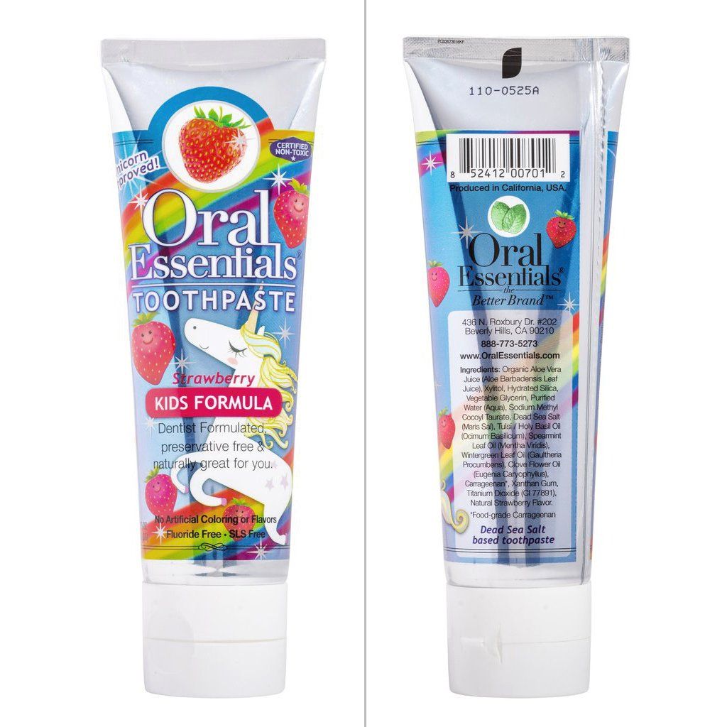
Oral essentials began as a dentist-developed natural mouthwash with a high-end market positioning. Their original packaging did not reflect their price point nor the quality of the product. I began with the mouthwash and took on their new products as they came out of development ready for market. Our newly designed toothpaste tubes won the gold medal first prize for package design that year and helped gain interest from major chains including Whole Foods. The Kid's strawberry product design stands out as one of my proudest pieces. In all products I worked closely with the various printing resources to achieve top-shelf results.
MedFax
REBRANDING
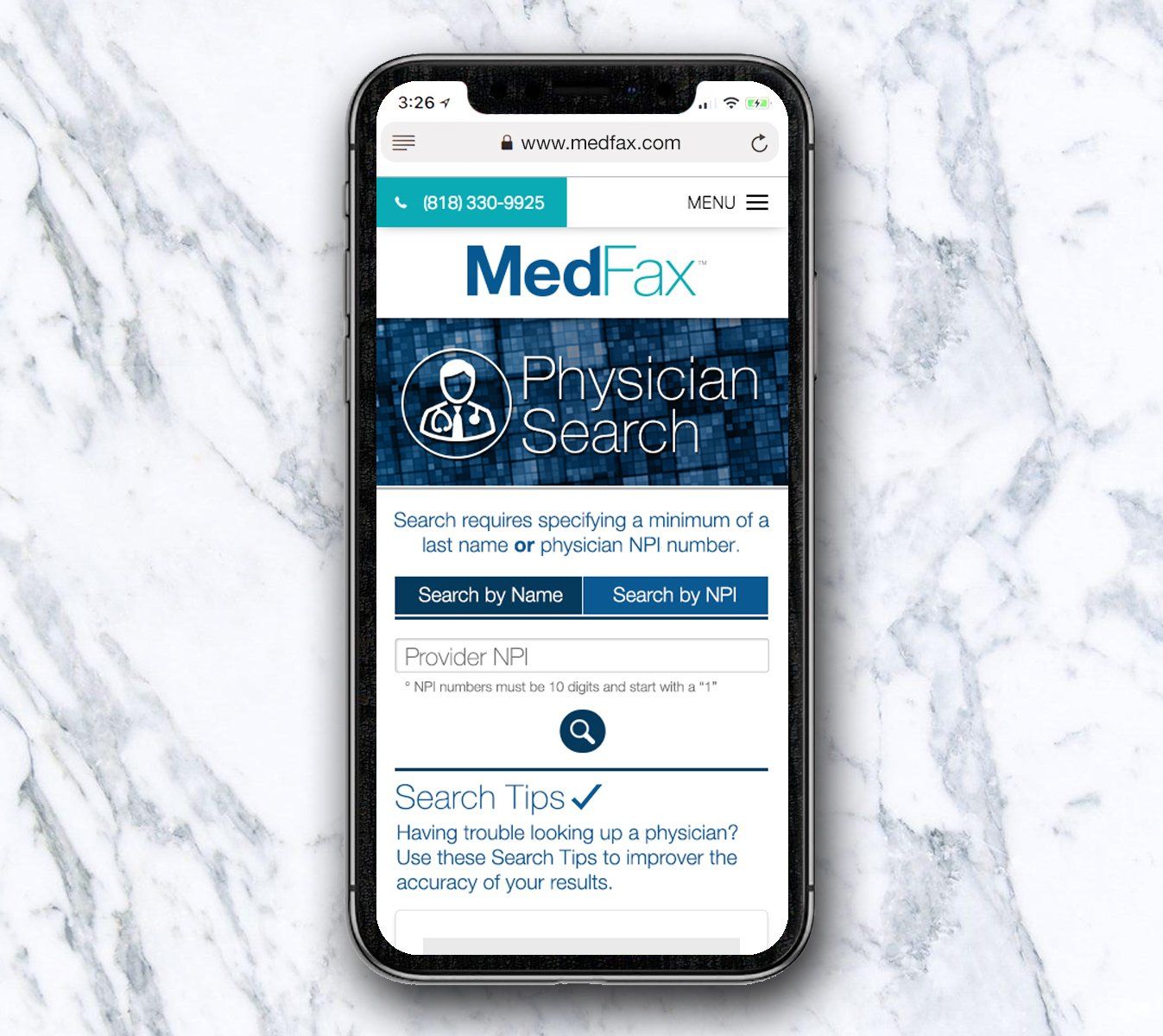
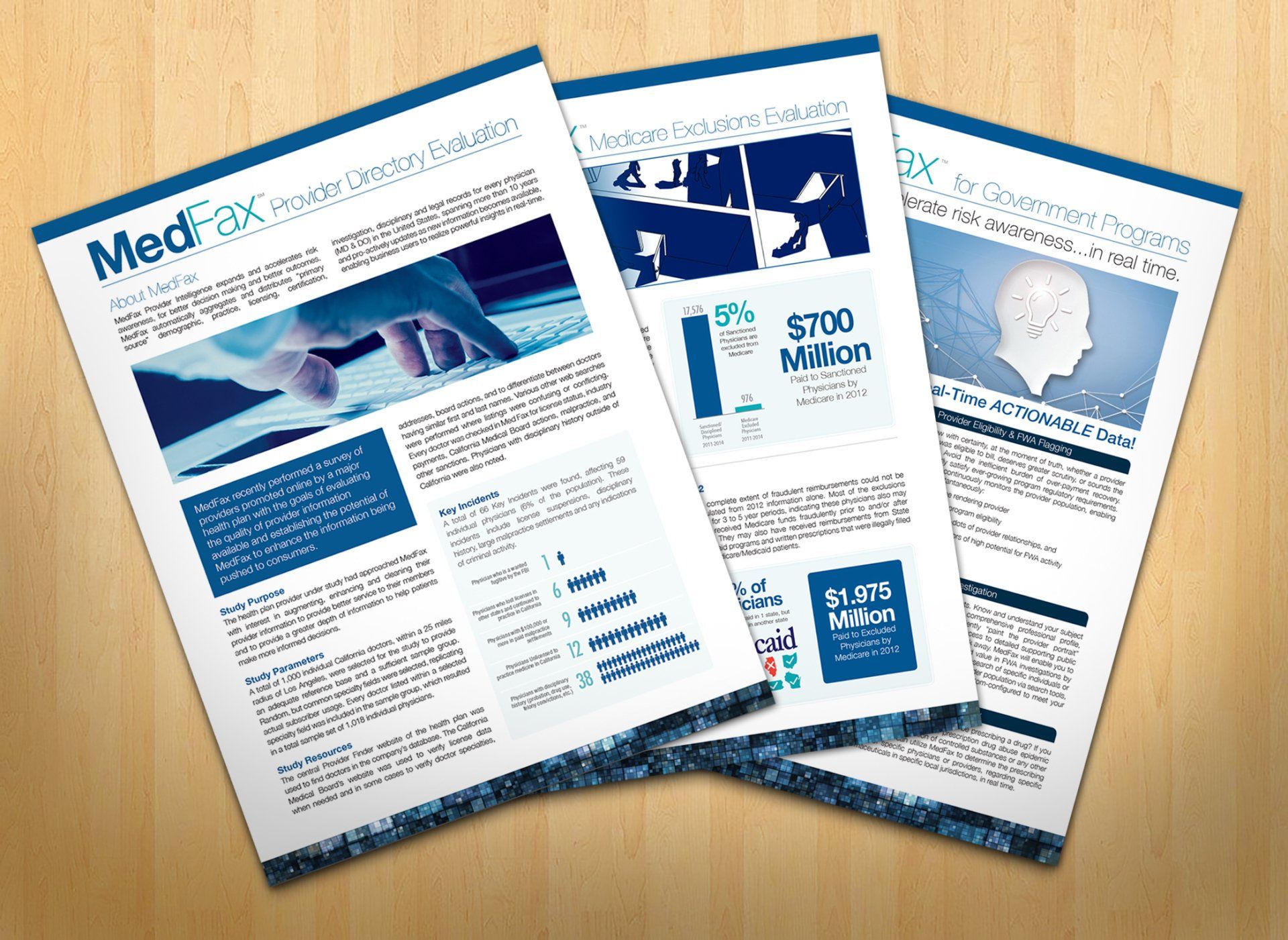
MedFax is a is a Tech Start-Up in the medical data space which began primarily as a B2C idea with an app for broad public use. However, as the company developed they carved a niche with insurance providers and pivoted to B2B. They needed a rebrand which reflected this and properly conveyed their organizational concept - tech, data and reliable information updated in real time. My work covered their front-facing website, apps and all UIs and overall UX along with print and marketing collateral from brochures and 1-sheets to banners and marketing campaigns.
InfiniteAloe
BRANDING, PACKAGE DESIGN & ART DIRECTION
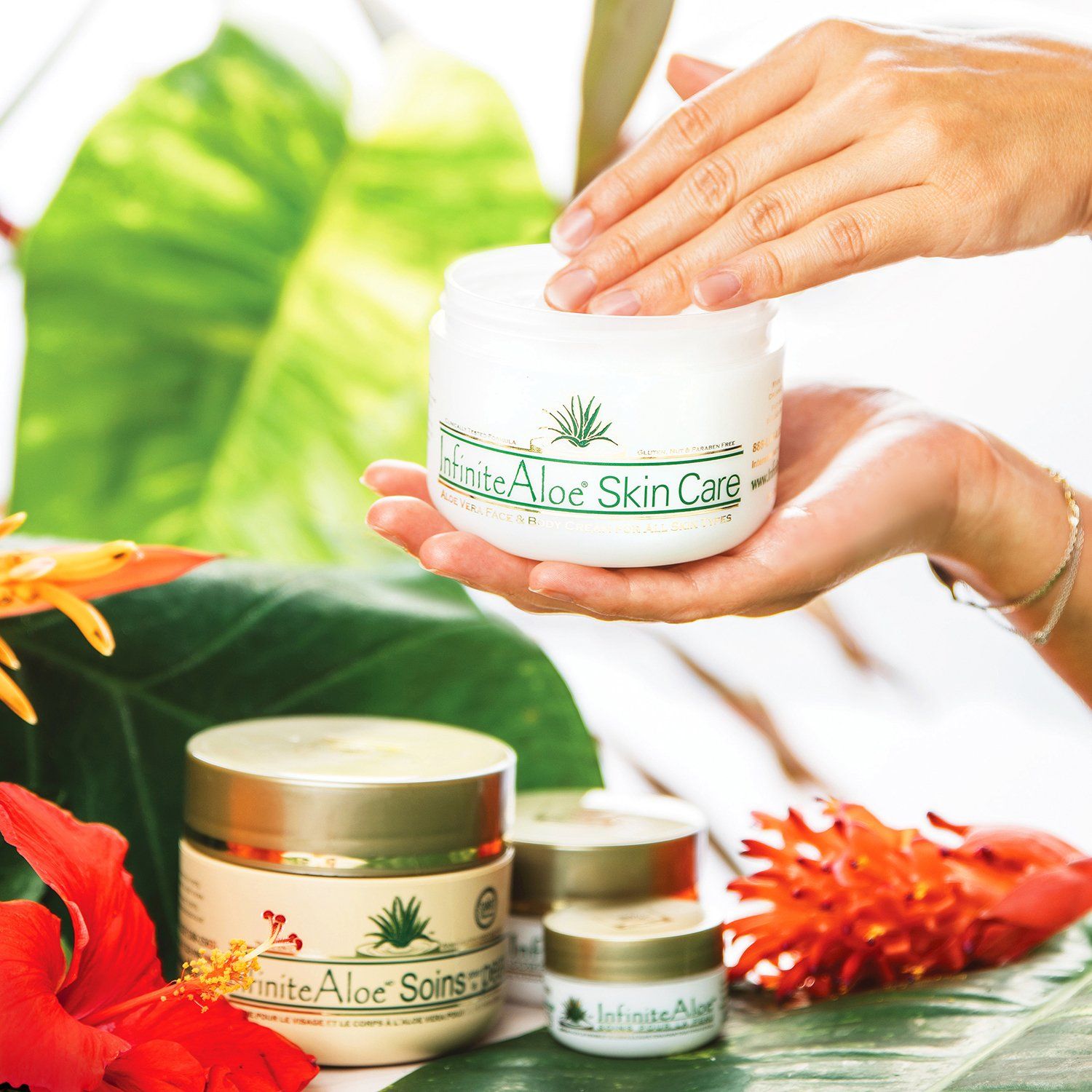
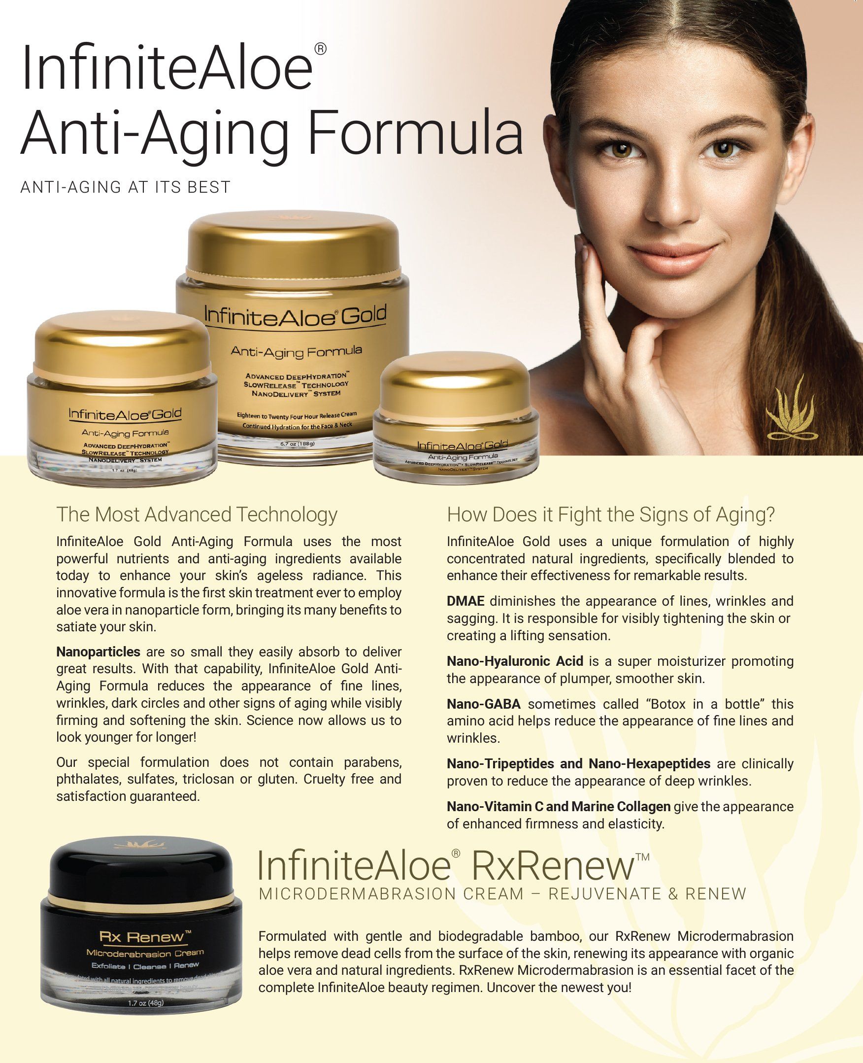
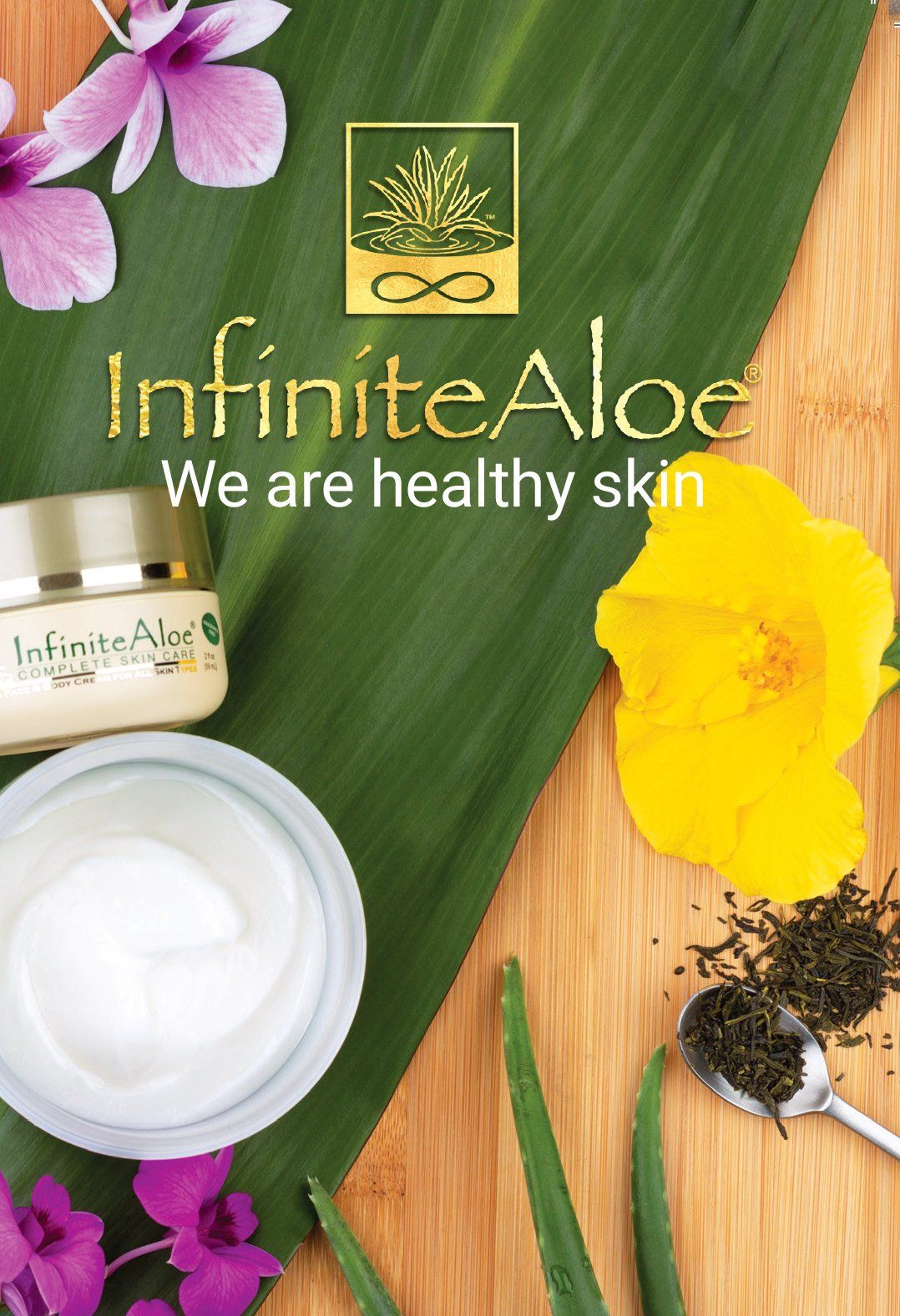
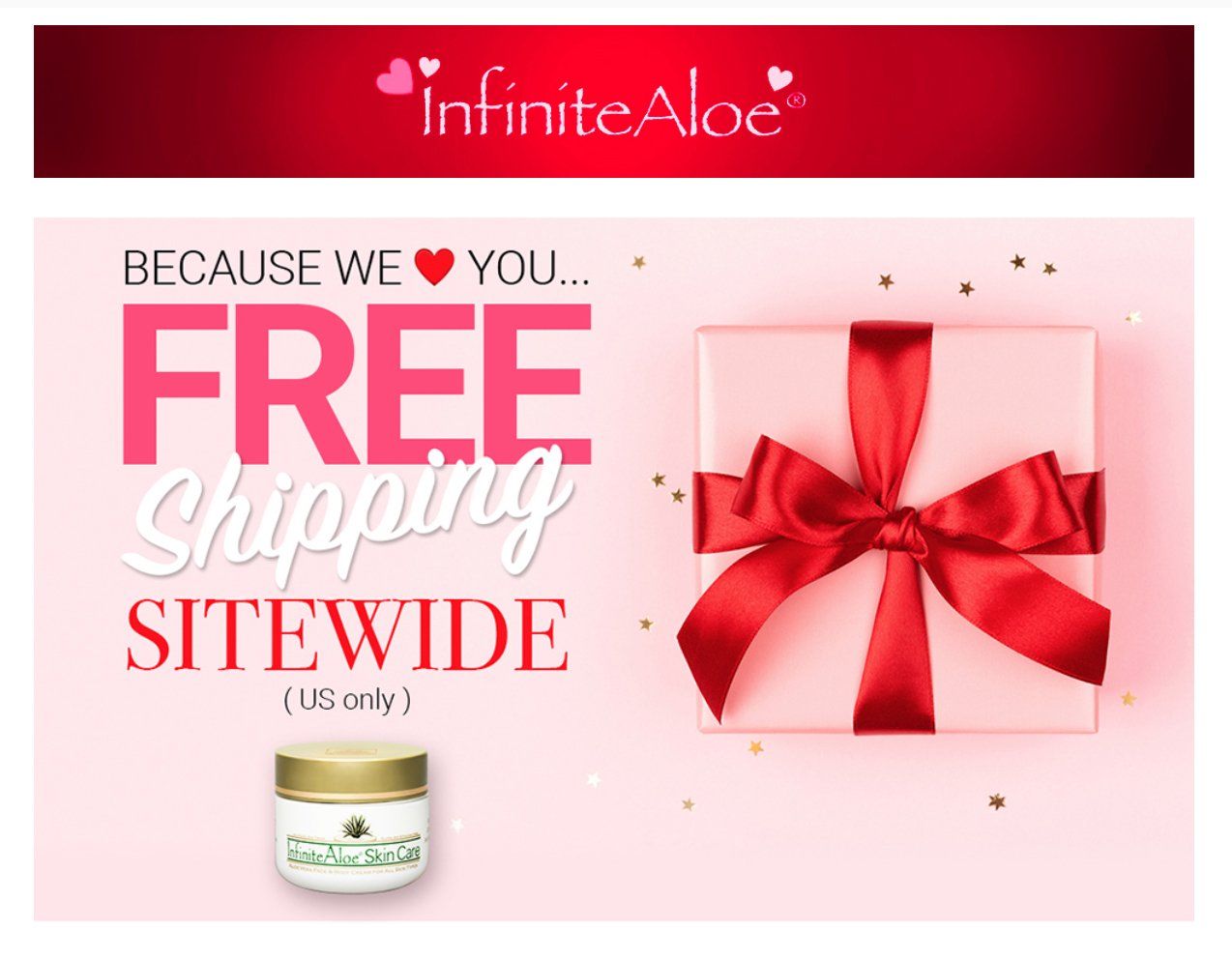
InfiniteAloe had been selling cream for 15+ years and maintained a devoted customer base. Their existing marketing didn't align with the established buttons and identified market segment, had become dated, etc. I gave the company a fresh look emphasizing what customers appreciated about the products and standardized the packaging while introducing improvements without jeopardizing their strong brand recognition.


